Package design · UNSW Sydney · April–May 2025
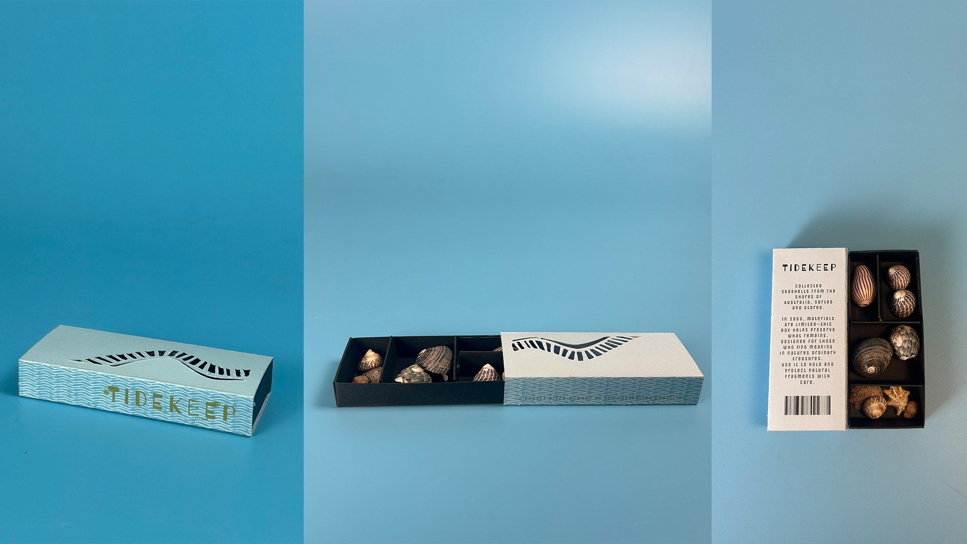
A pocket-sized case for found seashells, set in 2050 when materials are scarce. Inspired by collector's trays, it stores, sorts, and cleans what you find.
Graphic treatment, type & color
Every element continues the ocean's patterns so attention stays on the shells. Wave-like halftones wrap the sides, spiral doodles echo shell forms, and the cover's ladder of cut-outs follows the movement of tides and currents.
Wave blue #6AA9B9
Olive text #737B1C
Light blue cover
Black inner case



Tidekeep
Collected seashells from the shores of Australia, sorted and stored.